|
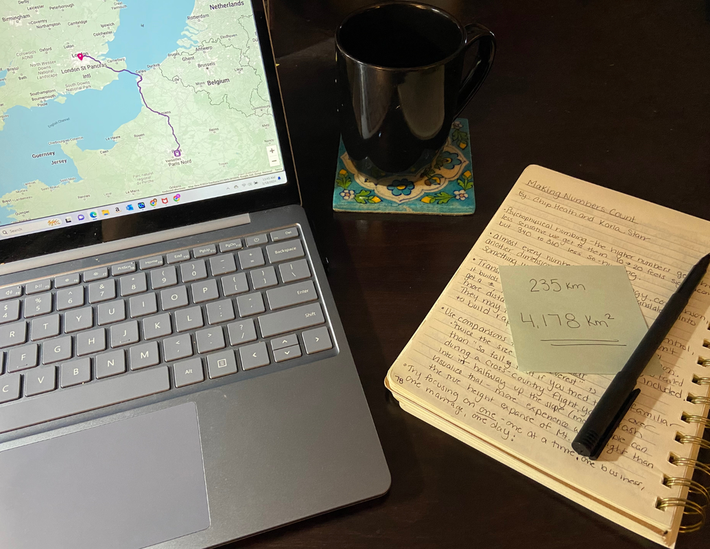
I am currently working on a microlearning course for a heritage project. The content is targeted at the staff at a tourism company transporting people to (and around) a World Heritage site. The goal of this project is to convey information to the staff. More importantly, we want to convey information that the staff will then pass on to customers. In the micro-course, I am mulling over how to communicate a numerical fact: the area of the heritage site. I went back to some notes I took last year after reading Making Numbers Count: The art and science of communicating numbers by Chip Heath and Karla Starr. (To see what else I read this year, check out my reading year-in-review). I thought I would share my process. I think many professionals (me included) should spend more time considering how we talk about numbers. Scientists and academics are often accused of being poor communicators to those outside their fields. In graduate school, most of us were trained to write a certain way. Failing to do so often meant failing to have your research published in peer-reviewed journals. Failing to publish in these journals could translated into zero academic job offers. Big stakes, if that was what you were after. So, you had to write in a certain style, a style that, coincidentally, is inclusive to those in your field (and completely confusing to those who are not). During the review process of one of my own scientific papers, a reviewer told me my writing was “too colloquial.” As if I wasn’t feeling inadequate already, I had to look up the definition of that word. Smirk. Fast forward a few years. Today, I would rather my writing be “too colloquial.” I want people to read what I write. Using informal or conversational language is one way to connect with those you want to read your words, especially if they are new to the subject. This past year I picked up a copy of Making Numbers Count, thinking it might have some useful tips for communicating clearly with numbers (it did). Then, this past month while working on my project, I came across a wieldy numerical fact. Time to try out what I learned. The fact I was working into the course was the size of the World Heritage area. The total area was described in formal documentation as stretching “235 km from East to West, covering an area 4,178 km2” Step one - I needed to consider whether precision in communicating this fact was necessary. That’s a very precise measure of size. Is it necessary? To answer this, I considered my communication goals. That would ultimately determine how much translation or reworking was needed. The area size was taken from a policy document requiring precision. But my goal was to educate tourism employees, in hopes they would pass on their new knowledge to tourists. Neither the employees nor the tourists really need extreme precision. What they need are numbers that make sense and, in the case of the staff, numbers they could remember later on. With my aim to provide an interesting and memorable fact, at the expense of precision, the current statement needed to be rethought. It had two unfriendly, overly precise numbers in it: 235km and 4,178 km2. Complicated numbers are actually pretty problematic if included where they don’t need to be. In Making Numbers Count, the authors explain how complicated numbers take up too many slots in our memory. If we manage to memorize them, we don’t remember anything else. In other words, if I was successful in getting my audience to remember the heritage site was “235 km from East to West, covering an area 4,178 km2”, they might not remember anything else. Yikes. So, if simple is better, I needed to simplify those numbers. One way to do that is to round - up or down. People remember simpler numbers better. and recollection, not precision, served my end goals. So, I tried it out:
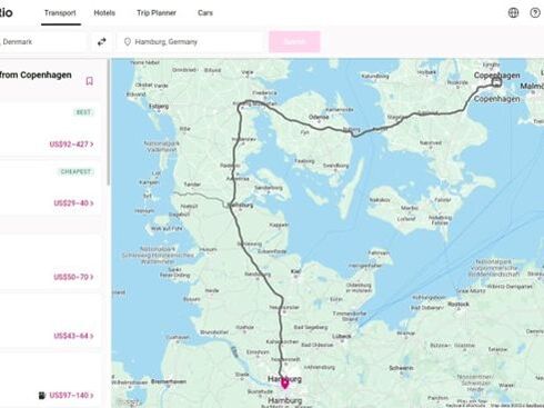
Second thing I considered was comprehension. Would these numbers make sense to my audience? If not, you can forget about being interesting and memorable. Communicating numbers in a way that doesn't make sense to your audiences has a steep cost. According to Heath and Starr, “Translating numbers is more than just quality control, it builds stronger relationships. When people don’t get a number, they not only miss the number itself, but feel more distanced from you and your presentation. They may tune out or tune YOU out because you failed to build rapport that makes them feel included.” (a side note, fractions are even less understood than complicated whole numbers. In a fascinating study, the fast-food chain A&W learned why their idea to counter McDonald’s ¼ pounder with a ⅓ pounder failed miserably…most people believed they were getting less). To evaluate the likelihood my fact could be easily understood, I needed to figure out who my audience was more specifically. Actual numbers aside, the background of the staff would determine if the number system would be understood. This fact used the metric system…was my audience comfortable with the metric system? If they were American, maybe not. I should consider converting to miles, before I even started playing around with the actual numbers. Translate the system first. At this point I suspected much of my staff audience were coming from Europe, so the metric system was fine. This fact also guided me in my next experiment to communicate better: using familiar comparisons. In Heath and Starr’s book, they encourage comparisons that take an unmemorable figure and make it recognizable. You can do this by comparing it to something your audience understands the size of. While I can’t guarantee the knowledge set of each person, I can make assumptions based on cultural background. For example, the distance between New York City to the popular seaside destination of Montauk, Long Island is roughly 118 miles, close enough to be comparable in distance (235 km = 152 miles). Those who summer in the Hamptons would understand this distance. They may have traveled it many times, easily recalling the time and stretch of land associated with the journey. But Europeans? That would likely be a meaningless (and annoying) comparison. This micro-course was to be optional, meaning they could quit at any time. Best not to annoy busy employees during an optional training. I needed comparisons that made sense to them. At this point, I suspected many would be Danish. I started searching for the distance between well-known places in Denmark. I started with the capital (Copenhagen) and looked at neighboring cities on a map. Helsingor - 53km. So my distance was the same as driving between these two Danish cities, three times. Okay, but not great. Kalundborg and Copenhagen - 106 km. My distance was like driving from Copenhagen to Kalundborg and back again. Better. But was this a well-known distance to Danes? Is Kalundborg a popular destination? I have no friggin’ idea. I make a note to ask someone who might know and move on. At some point, I clarified with my project partner that the staff was probably more diverse, with employees from all over Europe, not just Denmark. I ventured away from the narrow confines of Denmark for a broader geographical reference point. I started searching distances between other well-known European cities: Paris to London is 344 km flying. My area is the same as if you flew from Paris to London... but your plane went down somewhere in the English Channel. Great. Now my audience can’t stop imagining the horror of a plane crash (which is likely all they will remember about my anxiety-inducing course). Paris to Brussels is 263 km. My area was the same as driving from Paris to Brussels, if your car broke down right outside the city. Precision is not super important and 263 is close to 235…so maybe this is doable? Plus, car trouble is better than your plane crashing. Maybe I should bring back a Danish reference. Paris to Copenhagen is 1027 km…not even close. But Copenhagen to Stockholm is 522 km.. Copenhagen to Berlin is 355. Wait.. Copenhagen to Hamburg is 289 km! Comparable to the 235 km distance of the heritage area I am trying to communicate. But is that distance traveled enough for it to feel like a familiar distance to the staff I am communicating with? I don’t know. Does the fact that the driving path is not a straight shot but roundabout to avoid waterways make it a poor comparison to my number measuring straight from east to west? Probably. There were other techniques I read about worth trying as well. For example, converting the number to something other than a comparable distance: If you ran the distance of this World Heritage Park from one side to the other, it would take you about 48 hours and you would burn almost 12,000 calories…about 4 days' worth of calories! Or, I could convert it into a known object. This area stretching 235 km would cover roughly 2,500 American football fields. But WAIT, these are Europeans…so roughly 2,200 FIFA soccer fields. Maybe I should compare it to something more similar...like other parks. I did a dive into the size of National Parks in Europe and discovered the size of my heritage park was almost double the total area of Denmark's national parks (combined). If I am looking to portray vastness, this feels like a good way to do it. But will that trigger any feelings of defensiveness ('your parks are tiny compared to this')?
This is hard. But... communicating clearly is worth the effort. Otherwise, all the time spent on your project or presentation is a waste. If your audience walks away without learning anything, or worse, pissed off and alienated from your Big. Ugly. Numbers. you have not succeeded. Many of us might benefit from spending more time thinking about numbers. So-called experts in a topic are already fighting an uphill battle, research showing the more you know the worse you are at teaching it (a “curse of knowledge”). But you are making your job even harder if you keep throwing incomprehensible, abstract, complex numbers at people hoping to highlight something valuable to them. Well...wish me luck, I am still not sold on my national parks comparison. And I still need to figure out what to do with 4,178 km2.... Postscript: After writing this, I realized I could have explored how ChatGPT would translate these numbers. It’s likely that would have been a faster way to find size comparisons. While I am not opposed to trying that in the future, taking the long route this time really did have its benefits. I don’t think I really grasped how big this World Heritage area was until I started exploring the distance I would have to travel around Europe (or a football field) to get from one side to the other. Like many, my brain struggles with big numbers. The long path of this exercise without the aid of AI also brought the cultural background of my audience to the forefront of my attention. Diving down a rabbit hole of culturally appropriate translations will likely impact how I present the rest of the course. I don’t think an AI shortcut this time would have been beneficial. That doesn’t mean it couldn't be useful in the future. Comments are closed.
|
AuthorDr. Kathryn Grow Allen ('Katie'): Anthropologist, Archaeologist, Writer, Researcher, Teacher, Consultant, Yoga Lover, Nature Enthusiast, Book Worm, and Mother of Three. Archives
June 2024
Categories |
Proudly powered by Weebly


 RSS Feed